Hodgepodge
Color me blå
What’s more fun than nail polish names? “Tickle my France-y,” “I’m Not Really a Waitress” and “Princesses Rule” are among one brand’s 20 best-selling colors of all time. The same brand featured a shade called “Color Me Blue” which is blå in Norwegian. So let’s talk about interior color trends for 2021, with a Norwegian aesthetic in mind. When you think about Scandinavian design and colors, you probably think minimalistic black, neutral grays and shades of white. But the truth is, Scandinavians love color. That’s why Stressless furniture comes in so many vivid and vibrant hues.
This year’s interior color palette is all about warmth and coziness with a pop of color. We’ve spent the past twelve months cocooned in our homes with no real end in sight. In fact, the work-at-home shift may prove permanent for various jobs that rely mostly on technology. People are no longer tied to the office, which makes your home environment even more important. We’re still craving comfort colors—nurturing shades, earth tones and creamy, indulgent hues the color of biscuits and butter.
Home has become the hub of family and work life. It’s equal parts office and sanctuary with the constant hum of family, pets and children going about the business of living. Here’s where the color comes in. Picture painting your kitchen walls a sunshiny shade of yellow. Pantone’s color of the year is called “Illuminating” and is meant to evoke “hope and optimism.” Yellow is a primary color, bright and energizing, often associated with joy and happiness. The Norwegian word for sunshine is solskinn.
Shutterstock’s color of 2021 is “Tidewater Green,” that deep teal hue, inspired by “the calm of the ocean.” Painted furniture is a fun way to incorporate accent colors into your space. Imagine teal chairs around a blonde wood breakfast table or a teal dresser in your bedroom with a vase of yellow tulips. Teal combines the calming qualities of blue with the rejuvenating properties of green. For Tibetan monks, teal symbolizes the infinity of sea and sky. Which takes us back to Scandinavian style.
The Scandinavian design sensibility is about bringing the outside in, with natural fibers such as linen, muslin and wool, organic shapes rather than sharp edges and colors found in nature. Scandinavians seek balance and harmony in their surroundings. Whether it’s sunshine or seaweed or pale Nordic skies, you can capture the essence of these colors to both soothe and enliven your surroundings.
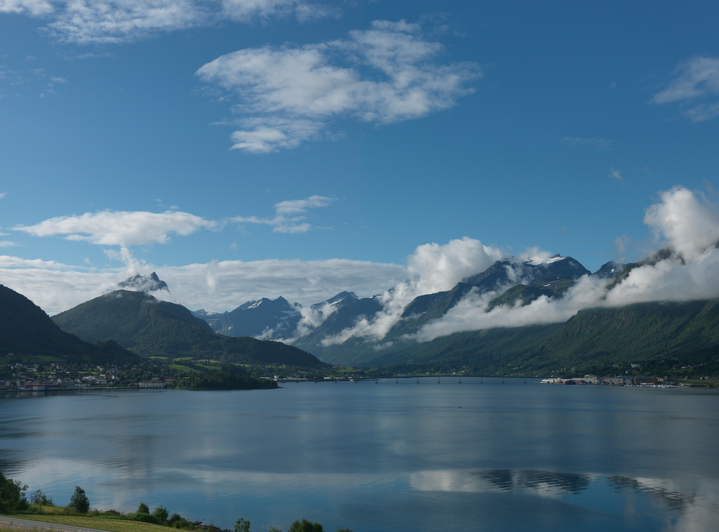
There’s a Norwegian proverb that says, “Behind the clouds, the sky is always blue.” It speaks to the optimism of a culture and its people, as well as to the harmonious balance of nature, which is inherent in Scandinavian design.


